

Choosing the Perfect Contrast Trim
If you’ve been around during our renovation then you know that I had the most difficult time committing to paint colors.
Hillside Farmhouse:
We had a contrast trim at hillside, and absolutely loved it.
Hillside Farmhouse paint colors:
Walls: Sherwin Williams Extra White
Trim & doors: Sherwin Williams Requisite Gray

Our new house:
We chose Benjamin Moore Chantilly Lace for our white walls- this is a very neutral white. I chose it because there are not strong warm or cool undertones; a very true white.

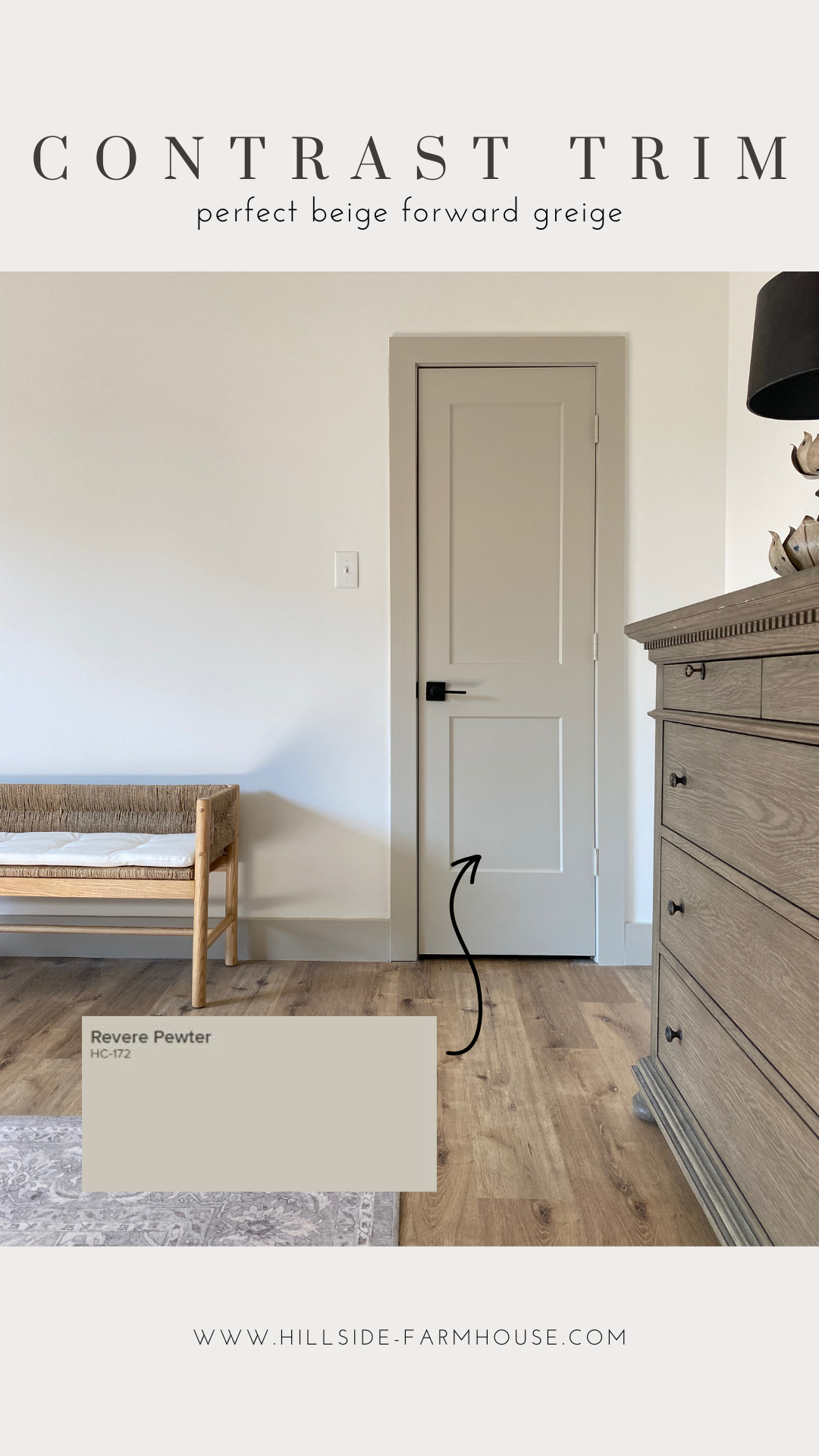
For the contrast trim I wanted a more beige forward greige then we had at Hillside Farmhouse, but I was having trouble deciding how much contrast I wanted it to have.
A few colors I strongly considered in the process
Benjamin Moore Balboa Mist
Benjamin Moore Pale Oak
Benjamin Moore Edgecomb Gray
Benjamin Moore Baby Fawn
Benjamin Moore Swiss Coffee
Benjamin Moore Revere Pewter

Baby Fawn and Edgecomb Gray were too beige/tan for what I was looking for. Swiss Coffee and Pale Oak ended up being too light without enough contrast. I was left with Balboa Mist and Revere Pewter, and ultimately decided on Revere Pewter because it was a bit darker and more on the beige side.
Revere Pewter: the perfect beige forward greige.
We absolutely love it in our home.